analysis
New York Green Taxi
Introduction
This is a self project data analyzing on new york green taxi based on tips and trips etc. creteria. The data can be found at NYC Government Website.
Visualization Result interactive map application
Requirement
R 3.6Shiny
library(RCurl)
library(ggplot2)
library(tidyverse)
library(scales)
library(dplyr)
library(shiny)
library(leaflet)
library(shinydashboard)
library(MASS)
library(lmtest)
Load Data
x = getURL('https://s3.amazonaws.com/nyc-tlc/trip+data/green_tripdata_2015-09.csv')
y = read.csv(text = x)
y = y[y$Fare_amount > 0, ]
## Dimenison of the data
rows = dim(y)[1]
cols = dim(y)[2]
- Based on the overview above, we can easily see that there are
r rowsobservation andr colsvariables
Visual On Vriable Trip Distance
ggplot(data = y, aes(y$Trip_distance)) +
  geom_histogram(
    breaks = seq(0, 600, by = 2),
    col = "black",
    fill = "cornflowerblue",
    alpha = .2
    ) +
  labs(title = "Histogram for Trip Distance Overview (with extreme values)") +
  labs(x = "Trip Distance", y = "Count")

## Overview of outlier bin
out_num = sum(y$Trip_distance > 10)
extreme = max(y$Trip_distance)

-
The range of the trip distance is widely spreaded. When we look in details, the maximum of this variable reaches
r extreme, and there is a high expression between 0 to 10 -
To take a closer look of the trip distance data, we need to concatenate extreme values (which, here, I chose values above 10) and have a direct visual on major distributed data
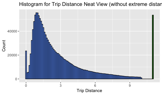
## Histogram For the Trip Distance Variable
y %>%
  mutate(Trip_Distance = ifelse(y$Trip_distance > 10, 11, y$Trip_distance)) %>%
  ggplot(aes(Trip_Distance)) +
  geom_histogram(binwidth = .1,
  col = "black",
  fill = c(rep("cornflowerblue", 110), "darkgreen")) +
  labs(title="Histogram for Trip Distance Neat View (without extreme distance spread") +
  labs(x="Trip Distance", y="Count")
-
According to the second histogram above, the
Trip_distancevariable contain values that highly skewed to right, and it can easily observe that the median is smaller than the mean. -
Based on the major distribution of the
Trip_distancedata, it seems data is approximately under lognormal distribution -
I generaly muted values greater than 10 as 11, and painted in green, and, then, we can take a look on extreme values. (The number of values that are greater than 10 is
r out_num, which is a notable number to be observed) -
The observation on
Trip_distancedata leads me to a hypothesis: Since the data doesn’t form in a normal distribution, we may consider that people in new york doesn’t take a trip is not random, and, there might be a cause result in trip distance mainly locates between range 0 to 10. (eg. trip time: since people usually work daily)
** Trip_Distance vs. Time**
To take a look at relation between trip distance and time, we can first group the distance value by time
## Create columns of pick and dropoff hour, value contain factors with 24 levels
y$hour_pickup = as.factor(substr(y$lpep_pickup_datetime, 12, 13))
y$hour_dropoff = as.factor(substr(y$Lpep_dropoff_datetime, 12, 13))

## Mean Trip Distance Group By Hours
mean_pickup = aggregate(Trip_distance ~ hour_pickup, y, mean)
mean_pickup$source = as.factor(3)
mean_pickup$hour_pickup = as.numeric(mean_pickup$hour_pickup)
colnames(mean_pickup)[1] = "hour"

mean_dropoff = aggregate(Trip_distance ~ hour_dropoff, y, mean)
mean_dropoff$source = as.factor(4)
mean_dropoff$hour_dropoff = as.numeric(mean_dropoff$hour_dropoff)
colnames(mean_dropoff)[1] = "hour"

## Median Trip Distance Group By Hours
median_pickup = aggregate(Trip_distance ~ hour_pickup, y, median)
median_pickup$source = as.factor(1)
median_pickup$hour_pickup = as.numeric(median_pickup$hour_pickup)
colnames(median_pickup)[1] = "hour"

median_dropoff = aggregate(Trip_distance ~ hour_dropoff, y, median)
median_dropoff$source = as.factor(2)
median_dropoff$hour_dropoff = as.numeric(median_dropoff$hour_dropoff)
colnames(median_dropoff)[1] = "hour"

df = bind_rows(mean_pickup, median_pickup, mean_dropoff, median_dropoff)
ggplot(df, aes(hour, Trip_distance, colour=source)) +
  geom_line() +
  labs(title="The Mean of Trip Distance vs. Hours") +
  labs(x="Hours", y="Trip Distance") +
  theme_bw()
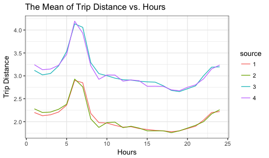
- According to the plot above, it seems the peak of the mean of trip distance usually happens during the morning, like 6 to 9, and there is a pop up after 8PM. If the cause of taking taxi is related to going to work, I may assume that people ususally take taxi to avoid being late and don’t really want to spend to much on taxi after work. The pop back after 8PM might infers that people want to get back home quickly after their night life, and the high volume of ending night life usually after 10 or 11PM.
Trip vs. Airports
There are three airports locate at new york city area, JFK, LGA, and Newark. According to the
data dictionary, we can determine if a trip was going to JFK and Newark by idenify the RateCodeID, where 2 is JFK and 3 is Newark. To find out trips that were going to LGA, I decided to figure out the location of the destination, since the dropoff longitude and latitude are given. We can easily find the boundary of longitude and latitude of LGA by going to this website
### JFK
jfk = y[y$RateCodeID == 2,]
mean_total_jfk = mean(jfk$Total_amount)
mean_fare_jfk = mean(jfk$Fare_amount)

### Newark
newark = y[y$RateCodeID == 3,]
mean_total_newark = mean(newark$Total_amount)
mean_fare_newark = mean(newark$Fare_amount)

### LGA
lga = y[y$Dropoff_longitude > -73.88 &
          y$Dropoff_longitude < -73.86  &
          y$Dropoff_latitude < 40.788 &
          y$Dropoff_latitude > 40.766 & y$RateCodeID != 2, ]
mean_total_lga = mean(lga$Total_amount)
mean_fare_lga = mean(lga$Fare_amount)

### Create a new dataframe of trips with destination as airports
airport = rbind(jfk, newark, lga)

count_airport = dim(airport)[1]
mean_total_airport = mean(airport$Total_amount)
mean_fare_airport = mean(airport$Fare_amount)
-
The number of the trips went to airports:
r count_airport -
Mean fare for the airport trips is $
r mean_fare_airport -
Mean total for the airport trips is $
r mean_total_airport
Overview of mean cost for each airport
| Mean Fare | Mean Total | |
|---|---|---|
| JFK | r mean_fare_jfk |
r mean_total_jfk |
| Newark | r mean_fare_newark |
r mean_total_newark |
| LGA | r mean_fare_lga |
r mean_total_lga |
To look more details about the airport trip, I decided to find out the trip relation with trip distance and time.
(Airport Trips with Time)
jfk_count = as.data.frame(table(jfk$hour_dropoff))
newark_count = as.data.frame(table(newark$hour_dropoff))
lga_count = as.data.frame(table(lga$hour_dropoff))
jfk_count$airport = as.factor('jfk')
newark_count$airport = as.factor('newark')
lga_count$airport = as.factor('lga')

df_airport = bind_rows(jfk_count, newark_count,lga_count)
df_airport$Var1 = as.numeric(df_airport$Var1)
ggplot(df_airport, aes(Var1, Freq, colour=airport)) +
  geom_line() +
  labs(title="Number of Trips vs. Hours") +
  labs(x="Hours", y="Number of Trips")+
  theme_bw()
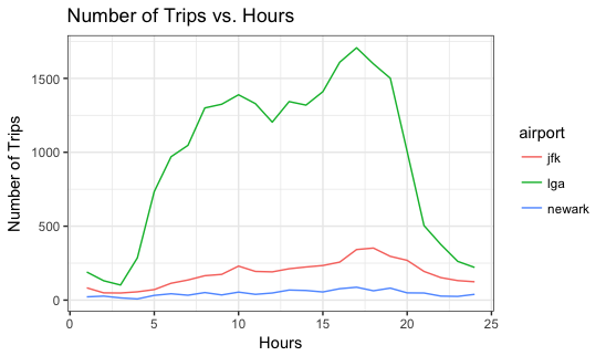
- Based on the graph above, the volume of going to lga is much larger than that of jfk and newark. But we still can get an intuitive notice that people usually going to airports from the morning 3AM to the night 23PM, and all three have a peak around 4-5PM. We, thus, can derive some information such that flights operate more during the evening, and usually start to operate the earliest one at aroung 4-6AM.
(Airport Trips with Time)
mean_dropoff_jfk = aggregate(Trip_distance ~ hour_dropoff, jfk, mean)
mean_dropoff_newark = aggregate(Trip_distance ~ hour_dropoff, newark, mean)
mean_dropoff_lga = aggregate(Trip_distance ~ hour_dropoff, lga, mean)

mean_dropoff_jfk$airport = 'jfk'
mean_dropoff_newark$airport = 'newark'
mean_dropoff_lga$airport = 'lga'
df_air_distance = bind_rows(mean_dropoff_jfk, mean_dropoff_newark, mean_dropoff_lga)
df_air_distance$airport = as.factor(df_air_distance$airport)
df_air_distance$hour_dropoff = as.numeric(df_air_distance$hour_dropoff)

ggplot(df_air_distance, aes(hour_dropoff, Trip_distance, colour=airport)) +
  geom_line() +
  labs(title="Mean Trips Distance vs. Hours") +
  labs(x="Hours", y="Mean Trip Distance")+
  theme_bw()
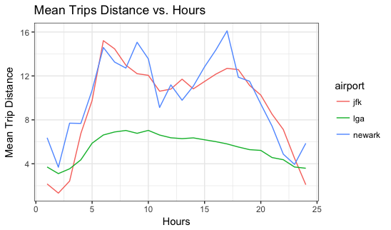
- Based on the graph above, the travling mean traveling distances for JFK and Newark are much more longer than the mean distance for LGA. This can be easily explain, since that LGA is locate in the major area of newyork, where nearby the manhattan and queens, two districts that contain most of population in new york, and JFK (locate at Brooklyn), Newark (locate at Jersey) much further from main districts of new york than LGA does.
** Tip Analysis**
First we create a derived variable tip ratio.
y$Tip_percentage = paste(round((y$Tip_amount / y$Total_amount) * 100, digits =
                            2), "%", sep = '')
y$Tip_ratio = y$Tip_amount / y$Total_amount
## Create a new dataframe that contain no factor variables. Thus we can try if there is a regression predictive model
nofactor = data.frame(RateCodeID = y$RateCodeID, Passenger_count = y$Passenger_count, Trip_distance = y$Trip_distance, Fare_amount =y$Fare_amount, Tip_amount = y$Tip_amount, Total_amoungt = y$Total_amount, Tip_ratio = y$Tip_ratio)
nofactor = nofactor[nofactor$Trip_distance > 11, ]
# generate a regression model with all features, and do statistical test to check model assumptions
all = lm(Tip_amount ~., data = nofactor)
## BIC: a method used to select variables
n = length(resid(all))
BIC <- step(all, direction = "backward", trace = 0, k = log(n))
summary(BIC)
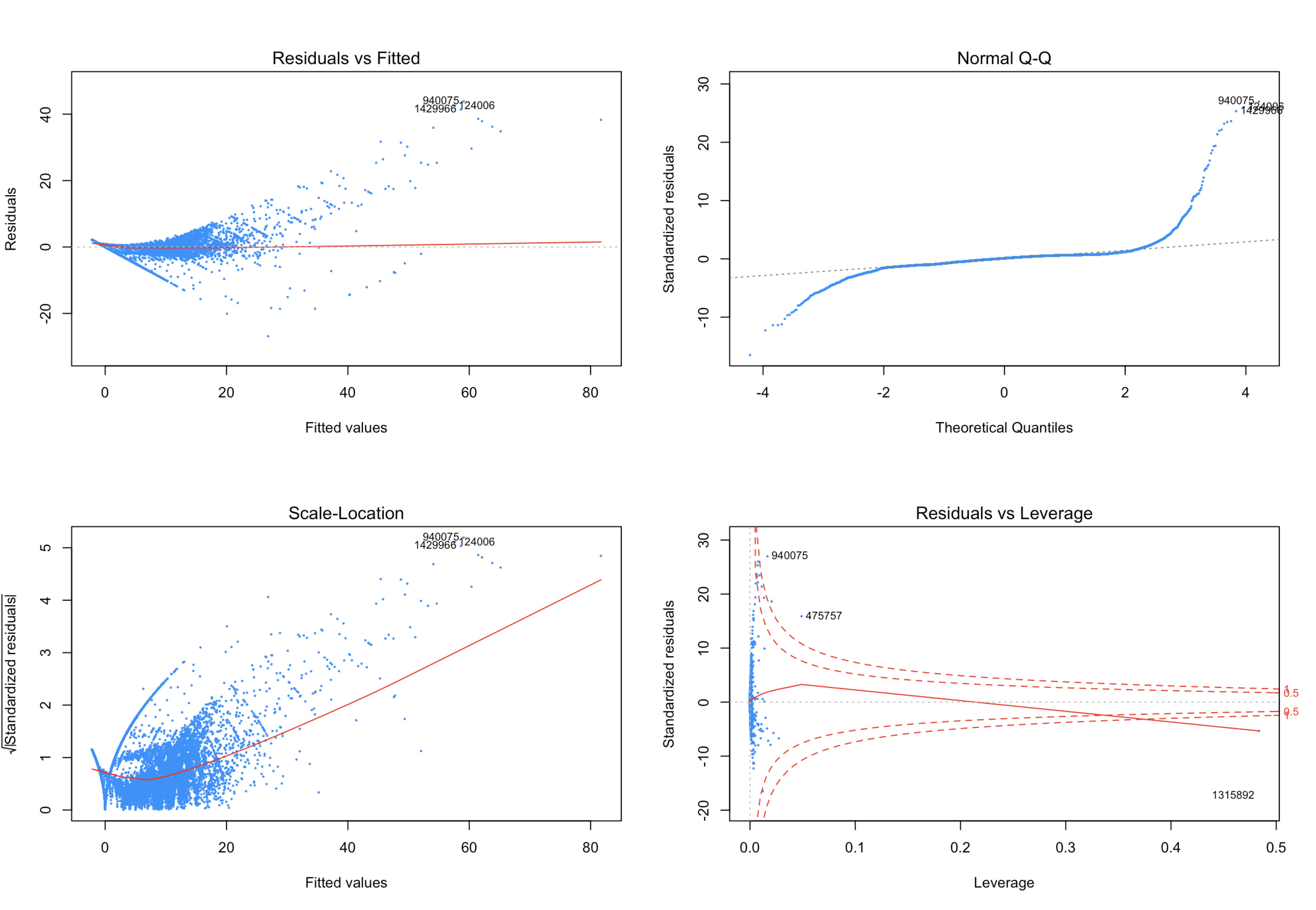
par(mfrow=c(2,2))
plot(BIC, pch=20, cex=0.3, col='dodgerblue')
lmtest::bptest(BIC) #p-val: 2.2e-16
set.seed(110116)
resid5000 = sample(resid(BIC), 5000)
shapiro.test(resid5000) #p-value: 2.2e-16
hat = hatvalues(BIC); hat_bar = mean(hat); i = which(hat > 2 * hat_bar)
n = which(abs(rstandard(BIC)) > 1)
index = which(cooks.distance(BIC) > 4 / length(cooks.distance(BIC)))
y1 = nofactor[-i,]
y2 = y1[-index,]
y3 = y2[-n,]
y3$Tip_amount = y3$Tip_amount + 0.01
all2 = lm(Tip_amount ~., data = y3)
par(mfrow=c(2,2))
plot(all2, pch=20, cex=0.3, col='dodgerblue')
trans = lm(log(Tip_amount) ~., data = y3)
plot(trans, pch=20, cex=0.3, col='dodgerblue')
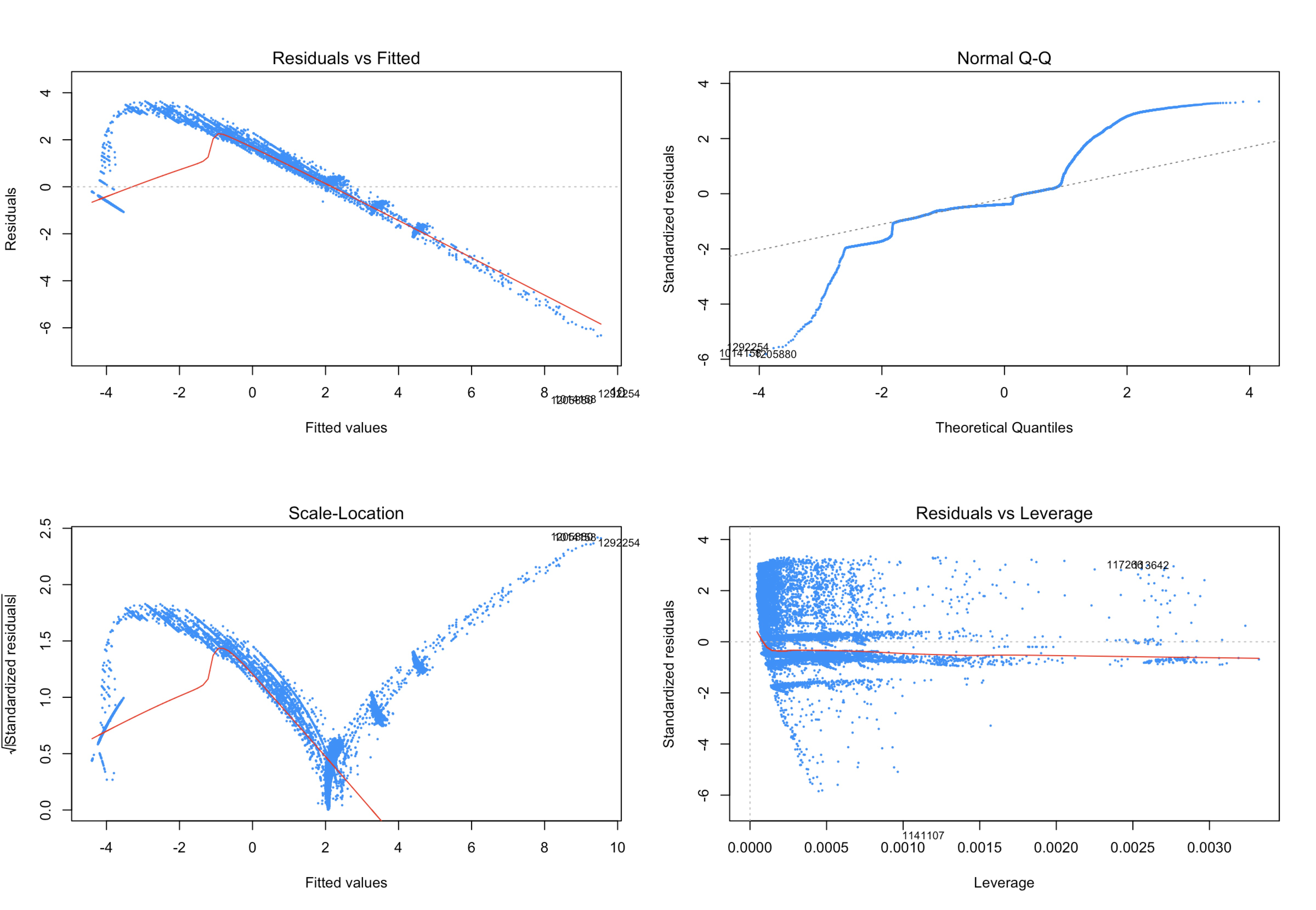
Even though all non-factor variables are significant in regression model, it seems like it still handle a good result after cleaning and transformation.
1. Regression Model
get_best_result = function(caret_fit) {
  best_result = caret_fit$results[as.numeric(rownames(caret_fit$bestTune)), ]
  rownames(best_result) = NULL
  best_result
}
rmse = function(actual, predicted) {
  sqrt(mean((actual - predicted) ^ 2))
}
calc_acc = function(actual, predicted) {
  mean(actual == predicted)
}
# test-train split
set.seed(26)
idx = createDataPartition(y3$Tip_ratio, p = 0.4, list = FALSE)
trn = y3[idx,]
tst = y3[-idx,]
In order to have a better understanding of the dataset and to find the most significant subset of predictors, we perform some visualization of the dataset.
histogram(trn$Tip_ratio, breaks = 20)

The following plots will explore the relationship of the feature variables with the response variable.
theme1 = trellis.par.get()
theme1$plot.symbol$col = rgb(.2, .2, .2, .4)
theme1$plot.symbol$pch = 16
theme1$plot.line$col = rgb(1, 0, 0, .7)
theme1$plot.line$lwd = 2

trellis.par.set(theme1)

featurePlot(x = trn,
            y = trn$Tip_ratio,
            plot = "scatter",
            type = c("p", "smooth"),
            span = .5,
            layout = c(4, 1))
cv_5 = trainControl(method = "cv", number = 5)
gbm_grid = expand.grid(interaction.depth = c(1, 2),
                       n.trees = c(500, 1000, 1500),
                       shrinkage = c(0.001, 0.01, 0.1),
                       n.minobsinnode = 10)
gbm_tune = train(Tip_ratio ~ ., data = trn,
                 method = "gbm",
                 trControl = cv_5,
                 verbose = FALSE,
                 tuneGrid = gbm_grid,
                 preProcess = c("scale"))

result = summary(gbm_tune)
result[1:5, ]

The above information shows that Tip_amount, Fare_amount, Total_amoungt and Trip_distance are the best predictors. We will consider these 4 predictors for the following methods.
(Methods) For our data analysis, we will consider the following methods:
-
Penalized linear regression (Elastic net)
-
Trees (Random forest)
-
Generalized Additive Models (GAMs)
For each method we will consider different sets of features:
-
small:Tip_amount,Fare_amount,Total_amoungtandTrip_distance -
int: significant interaction betweenTip_amount,Fare_amount,Total_amoungtandTrip_distance. That is,(Tip_amount + Fare_amount + Total_amoungt + Trip_distance)^2. -
full: all features -
huge: all features with all possible two way interactions
In particular, for int, we fit the linear regression model with all interactions between Tip_amount, Fare_amount, Total_amoungt and Trip_distance to obtain the significant interactions.
# glmnet + small
glmn_small = train(Tip_ratio ~ Tip_amount+Fare_amount+Total_amoungt+Trip_distance,
                   data = trn,
                   method = "glmnet",
                   trControl = cv_5,
                   tuneLength = 10)

# glmnet + int
glmn_int = train(Tip_ratio ~ (Tip_amount + Fare_amount + Total_amoungt + Trip_distance)^2,
                   data = trn,
                   method = "glmnet",
                   trControl = cv_5,
                   tuneLength = 10)

# glmnet + full
glmn_full = train(Tip_ratio ~ ., data = trn, method = "glmnet",
                   trControl = cv_5, tuneLength = 10)

# glmnet + huge
glmn_huge  = train(Tip_ratio ~ . ^ 2, data = trn, method = "glmnet",
                   trControl = cv_5, tuneLength = 10)

# cv train rmse
glmn_small_trn_rmse = get_best_result(glmn_small)$RMSE
glmn_int_trn_rmse = get_best_result(glmn_int)$RMSE
glmn_full_trn_rmse = get_best_result(glmn_full)$RMSE
glmn_huge_trn_rmse = get_best_result(glmn_huge)$RMSE

# test rmse
glmn_small_tst_rmse = rmse(tst$Tip_ratio, predict(glmn_small, tst))
glmn_int_tst_rmse = rmse(tst$Tip_ratio, predict(glmn_int, tst))
glmn_full_tst_rmse = rmse(tst$Tip_ratio, predict(glmn_full, tst))
glmn_huge_tst_rmse = rmse(tst$Tip_ratio, predict(glmn_huge, tst))
Trees (Random forest)
Tree is a non-linear, non-parametric, discriminative method. There are some ensemble methods of trees including bagging, random forest and boosting. Here we use the ensemble method of random forest. The tuning parameter is mtry in this case.
For this method, we only consider the sets of features small and int, as the other two sets of features full and huge contain a large number of variables and are not computationally efficient with random forest.
# random forest grid
rf_grid = expand.grid(mtry = c(1, 2, 3, 4))

# rf + small
rf_small = train(Tip_ratio ~ Tip_amount+Fare_amount+Total_amoungt+Trip_distance,
                 data = trn, trControl = cv_5,
                 method = "rf", tuneGrid = rf_grid)

# rf + int
rf_int = train(Tip_ratio ~ (Tip_amount+Fare_amount+Total_amoungt+Trip_distance)^2,
               data = trn, trControl = cv_5, method = "rf", tuneGrid = rf_grid)

# cv train rmse
rf_small_trn_rmse = get_best_result(rf_small)$RMSE
rf_int_trn_rmse = get_best_result(rf_int)$RMSE

# test rmse
rf_small_tst_rmse = rmse(tst$Tip_ratio, predict(rf_small, tst))
rf_int_tst_rmse = rmse(tst$Tip_ratio, predict(rf_int, tst))
Generalized Additive Models (GAMs)
GAMs is a non-linear, parametric, generative method. The tuning parameter is degrees of freedom (df).
For this method, we only consider sets of features small and full. We don’t consider any interaction among features.
# GAM grid
gam_grid = expand.grid(df = 1:10)

# GAM + small
gam_small = train(Tip_ratio ~ Tip_amount+Fare_amount+Total_amoungt+Trip_distance,
                  data = trn, trControl = cv_5,
                  method = "gamSpline", tuneGrid = gam_grid)

# GAM + full
gam_full = train(Tip_ratio ~ ., data = trn, trControl = cv_5,
                  method = "gamSpline", tuneGrid = gam_grid)

# cv train rmse
gam_small_trn_rmse = get_best_result(gam_small)$RMSE
gam_full_trn_rmse = get_best_result(gam_full)$RMSE

# test rmse
gam_small_tst_rmse = rmse(tst$Tip_ratio, predict(gam_small, tst))
gam_full_tst_rmse = rmse(tst$Tip_ratio, predict(gam_full, tst))
| CV RMSE | TEST RMSE | |
|---|---|---|
| GAM Full Model | r gam_full_trn_rmse |
r gam_full_tst_rmse |
| Elastic Full Model | r glmn_full_trn_rmse |
r glmn_full_tst_rmse |
| Elastic Huge Model | r glmn_huge_trn_rmse |
r glmn_huge_tst_rmse |
| Elastic Small Model | r glmn_small_trn_rmse |
r glmn_small_tst_rmse |
| Elastic Interact Model | r glmn_int_trn_rmse |
r glmn_int_tst_rmse |
| GAM Small Model | r gam_small_trn_rmse |
r gam_small_tst_rmse |
| Random Forest Interact Model | r rf_int_trn_rmse |
r rf_int_tst_rmse |
| Random Forest Small Model | r rf_small_trn_rmse |
r rf_small_tst_rmse |
As we can see, Random Forest Small model performs the best among all the models we consider, since it has the largest $R^2$ and the lowest $rmse$.
get_best_result(rf_small)
Features perspective
As we can see from results, generally we can see that small model contain significant variables outperforms other models with all of features. That is, when we consider significant features in the dataset, instead of the whole features we observe from the plots, the model will perform better with respect to predictions.
This actually makes sense if we go back to check the feature plot. From the feature plot, actually part of variables somehow contribute to the response variable Tip_ratio, that is, the red lines in the plot are not flat.
2. Classification
During the classificstion modeling, I am looking for, upon which conditions, passengers would give a tip.
class = y
class$Tip_ratio = as.factor(ifelse(class$Tip_ratio == 0, "None",ifelse(class$Tip_ratio < 0.16, "Normal", "High")))
class = class[, -c(1,2,3,4,5,6,7,13,14,16,17,18,22,24)]
class$hour_dropoff = as.numeric(class$hour_dropoff)

set.seed(100)
cls_idx = sample(1:nrow(class), 20000)
cls_trn = class[cls_idx,]
cls_tst = class[-cls_idx,]
Visual on classification
featurePlot(x = cls_trn[,c(1,2,8)],
            y = cls_trn$Tip_ratio,
            plot = "density",
            scales = list(x = list(relation = "free"),
                          y = list(relation = "free")),
            adjust = 1.5,
            pch = "|",
            layout = c(2, 1),
            auto.key = list(columns = 2))
(Methods)
For our data analysis, we will consider the following methods:
-
Linear Discrimitive Analysis(LDA)
-
Naive Bayes (NB)
-
K-nearest-neighbors (KNN)
For each method we will consider the same set of features
LDA
cls_lda = lda(Tip_ratio ~ ., data = cls_trn)
cls_lda_trn_pred = predict(cls_lda, cls_trn)$class
cls_lda_tst_pred = predict(cls_lda, cls_tst)$class
lda_acc = calc_acc(predicted = cls_lda_tst_pred, actual = cls_tst$Tip_ratio)
NB
cls_nb = naiveBayes(Tip_ratio ~ ., data = cls_trn)
cls_nb_tst_pred = predict(cls_nb, cls_tst)
nb_acc = calc_acc(predicted = cls_nb_tst_pred, actual = cls_tst$Tip_ratio)
KNN
X_trn = cls_trn[, -c(10,11)]
y_trn = cls_trn$Tip_ratio

# testing data
X_tst = cls_tst[, -c(10,11)]
y_tst = cls_tst$Tip_ratio

knn_pred = class::knn(train = scale(X_trn),
                test  = scale(X_tst),
                cl    = y_trn,
                k     = 10,
                prob  = TRUE)
knn_acc = calc_acc(predicted = knn_pred, actual = y_tst)
| Accuracy | |
|---|---|
| LDA Model | r lda_acc |
| NB Model | r nb_acc |
| KNN Model | r knn_acc |
As we can see, with the highest accuracy among all, KNN model performs the best among all the models we consided, and we could predict whether tip ratio lying in the area of None, Normal or High by looking through featurs on longitude, latitude, Passenger_count, Trip_distance, Fare-amount, Payment_type, and Total_amount.
#5. Visualization on NYC Green Taxi
For the visualization part, I built a shiny interactive map application where points states the drop location at New York City, and colored by tip ratios.
## Since the datasets is too large, and it would be take overall 2.9GB to visualize whole datasets, so I random sampled 10000 observations and visualize them on a map.
data = y
data = data[,c("longitude", "latitude", "hour_dropoff", "Total_amount","Passenger_count","Trip_distance"
               , "Trip_type", "Payment_type", "Tip_ratio", "Tip_amount")]
data = data[data$longitude < 0 & data$latitude > 0,]
sample_row = sample(nrow(data), 10000, replace = FALSE, prob = NULL)
data = data[sample_row,]
data$hour_dropoff = as.numeric(data$hour_dropoff)

header <- dashboardHeader(
  title = "NYC Green Cab"
)
# create the body
body <- dashboardBody(
  fluidRow(
    column(width = 6,
           box(width = NULL, solidHeader = TRUE,
               leafletOutput("map", height = 500)
           )
    ),
    # create sliders
    column(6,
           fluidRow(
             column(6,h5("Demo visualization of New York Green Cab pickups on September 2, 2015."))
           ),
           fluidRow(
             column(6,sliderInput("range_passenger",label = "Passengers",
                                  value = range(data$Passenger_count),
                                  min = min(data$Passenger_count),
                                  max = max(data$Passenger_count),
                                  step = 1))
           ),
           fluidRow(
             column(6,sliderInput("range_fare",label = "Fare Amount",
                                  value = range(data$Total_amount),
                                  min = min(data$Total_amount),
                                  max = max(data$Total_amount),
                                  pre = '$'))
           ),
           fluidRow(
             column(6,sliderInput("range_distance",label = "Distance",
                                  value = range(data$Trip_distance),
                                  min = min(data$Trip_distance),
                                  max = max(data$Trip_distance),
                                  post = 'miles'))
           ),
           fluidRow(
             column(6,sliderInput("range_hour",label = "Hour past midnight",
                                  value = min(data$hour_dropoff),
                                  min = min(data$hour_dropoff),
                                  max = max(data$hour_dropoff),
                                  animate = TRUE,
                                  step = 1))
           ),
           fluidRow(
             column(3,checkboxGroupInput("Payment_type",label = "Payment Mode",
                                         choices = list("Credit Card"=1, "Cash"=2),
                                         selected = c(1,2))),
             column(3,checkboxGroupInput("Trip_type",label = "Trip Type",
                                         choices = list("Street-Hail"=1, "Dispatch"=2),
                                         selected = c(1,2)))
           )
    )
  )
)

# Put together all UI constructors
ui <- dashboardPage(
  header,
  dashboardSidebar(disable = TRUE),
  body
)

# build the server
server <- function(input, output) {
  # filter data based on sliderInputs values
  filteredData <- reactive({
    subset(data,Passenger_count>=input$range_passenger[1] & Passenger_count<=input$range_passenger[2] &
             Total_amount>=input$range_fare[1] & Total_amount<=input$range_fare[2] &
             Trip_distance>=input$range_distance[1] & Trip_distance<=input$range_distance[2] &
             hour_dropoff==input$range_hour & Payment_type %in% input$Payment_type &
             Trip_type %in% input$Trip_type)
  })

  # create color palette. We will color by tippercentage
  colorpalette <- reactive({
    colorNumeric('PuOr',data$Tip_ratio)
  })

  # generate the map
  output$map <- renderLeaflet({
    leaflet(data) %>%
      addTiles(options = providerTileOptions(opacity = .5)) %>%
      setView(-73.9, 40.7, zoom = 10) #%>%

  })

  # generate an observer object that will overlay circles whenever there is an update on the slider
  observe({
    pal <- colorpalette()

    leafletProxy("map", data=filteredData()) %>%
      clearShapes() %>%
      addCircles(radius = 200, weight = 1, color = "#b7b7b7", fillColor = ~pal(Tip_ratio),
                 fillOpacity = 0.7, popup = ~paste(Tip_amount)) %>%
      clearControls() %>%
      addLegend(position = "bottomleft",pal = pal, values = ~Tip_ratio, opacity = 0.7, title = 'Tip (%)')
  })

}

# run the application
shinyApp(ui,server)