visual
Mama's Sunshine and Daddy's Rain
Description
This project is an reproduce and extended work on Edward Tufte’s plot (mainly using SF and LA weather data). In his example, the data set is taken from annual review of the weather by The New York Times. The graph shows daily high and low temperatures for 2003, for a normal year, and for record days, along with cumulative monthly precipitation. Some interesting inferences about average, variation, and rates of change over the seasons can be made visually. Note the flat part of the cycle through mid-December to mid-February and then a fairly rapid rise in temperature mid-February to May. And so on.
Requirement
R 3.6
Output
Reproduce Tufte plot on San Francisco Weather Data (Data Source)
Code
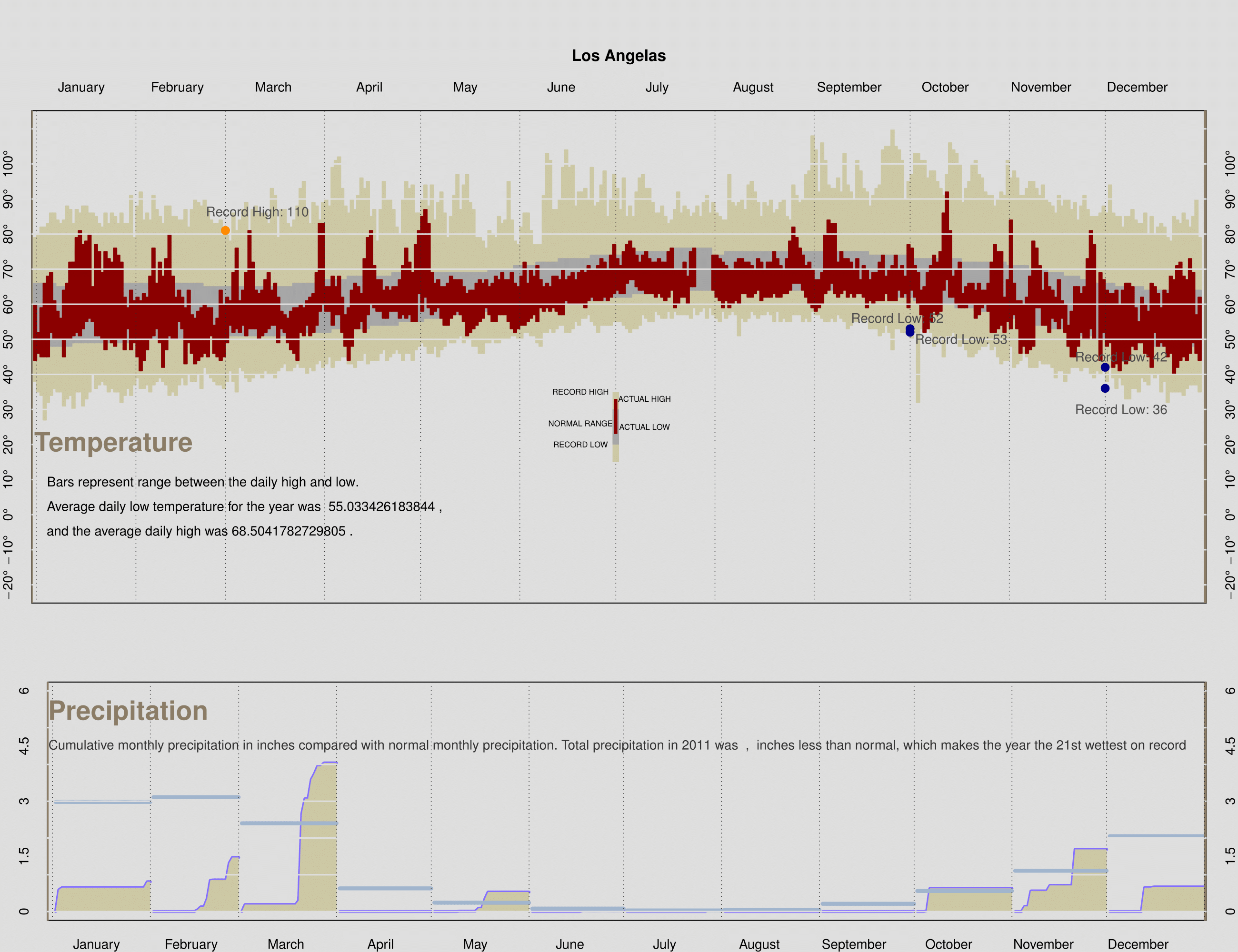
```r load("weather2011.rda") dgr_fmt <- function(x, ...) { parse(text = paste(x, "*degree", sep = "")) } makePlotRegion = function(xlim, ylim, bgcolor, ylabels, margins, cityName, xtop = TRUE) { # This function is to produce a blank plot that has # the proper axes labels, background color, etc. # It is to be used for both the top and bottom plot. # The parameters are # xlim is a two element numeric vector used for the two # end points of the x axis # ylim is the same as xlim, but for the y axis # ylabels is a numeric vector of labels for "tick marks" # on the y axis # We don't need to x labels because they are Month names # margins specifies the size of the plot margins (see mar parameter in par) # cityName is a character string to use in the title # xtop indicates whether the month names are to appear # at the top of the plot or the bottom of the plot # # See the assignment for a pdf image of the plot that is # produced as a result of calling this function. par(bg = bgcolor, mar = margins) plot(NULL, xlim = xlim, ylim = ylim, yaxt = 'n', xaxt = 'n') if(xtop){ axis(side = 2, at = ylabels, tick = FALSE, labels = dgr_fmt(ylabels)) axis(side = 4, at = ylabels, tick = FALSE, labels = dgr_fmt(ylabels)) }else{ axis(side = 2, at = ylabels, tick = FALSE, labels = ylabels) axis(side = 4, at = ylabels, tick = FALSE, labels = ylabels) } axis(side = 1 + 2 * xtop, at = c(15,45,75,105,135,165,195,225,255,285,315,345), tick = FALSE, labels = month.name) title(cityName) } drawTempRegion = function(day, high, low, col){ # This plot will produce 365 rectangles, one for each day # It will be used for the record temps, normal temps, and # observed temps # day - a numeric vector of 365 dates # high - a numeric vector of 365 high temperatures # low - a numeric vector of 365 low temperatures # col - color to fill the rectangles rect(xleft = day-1, xright = day, ytop = high, ybottom = low, col = col, border = col) } addGrid = function(location, col, ltype, vertical = TRUE) { # This function adds a set of parallel grid lines # It will be used to place vertical and horizontal lines # on both temp and precip plots # location is a numeric vector of locations for the lines # col - the color to make the lines # ltype - the type of line to make # vertical - indicates whether the lines are vertical or horizontal if(vertical){ abline(h = NULL, v = location, col = col, lty = ltype) }else{ abline(h = location, v = NULL, col = col, lty = ltype, lwd = 1.5) } } monthPrecip = function(day, dailyprecip, normal){ # This function adds one month's precipitation to the # precipitation plot. # It will be called 12 times, once for each month # It creates the cumulative precipitation curve, # fills the area below with color, add the total # precipitation for the month, and adds a reference # line and text for the normal value for the month # day a numeric vector of dates for the month # dailyprecip a numeric vector of precipitation recorded # for the month (any NAs can be set to 0) # normal a single value, which is the normal total precip # for the month lines(x = day, y = dailyprecip, col = "slateblue1", type = 'l', lwd = 3) polygon(x = c(day, max(day), day[1]), y = c(dailyprecip, 0, 0), col = "lemonchiffon3", border = NA) points(x = day, y = rep(normal, length(day)), col = "lightsteelblue3", type = "l", lwd = 4) } finalPlot = function(temp, precip){ # The purpose of this function is to create the whole plot # Include here all of the set up that you need for # calling each of the above functions. # temp is the data frame sfoWeather or laxWeather # precip is the data frame sfoMonthlyPrecip or laxMonthlyPrecip # Here are some vectors that you might find handy monthNames = c("January", "February", "March", "April", "May", "June", "July", "August", "September", "October", "November", "December") daysInMonth = c(31, 28, 31, 30, 31, 30, 31, 31, 30, 31, 30, 31) cumDays = cumsum(c(1, daysInMonth)) normPrecip = as.numeric(as.character(precip$normal)) ### Fill in the various stages with your code ### Add any additional variables that you will need here labels = paste(seq(-20,110,10), "^o ", sep="") remove_factor = function(x){ y = as.numeric(as.character(x)) return(y) } precip$precip = remove_factor(precip$precip) precip$normal = remove_factor(precip$normal) ### Set up the graphics device to plot to pdf and layout ### the two plots on one canvas pdf("rz_weatherplot_reproduce", width = 13 , height = 10) layout(matrix(c(1,1,2,2), nrow = 2, ncol = 2, byrow = TRUE), height = c(2,1)) ### Call makePlotRegion to create the plotting region ### for the temperature plot makePlotRegion(xlim = c(13,353), ylim = c(-20,110), bgcolor = "gray87", ylabels = seq(-20,100,10), margins = c(2,2,7,2), cityName = "Los Angelas") ### Call drawTempRegion 3 times to add the rectangles for ### the record, normal, and observed temps drawTempRegion(day = 1:365, high = temp$RecordHigh, low = temp$RecordLow, col = "lemonchiffon3") drawTempRegion(day = 1:365, high = temp$NormalHigh, low = temp$NormalLow, col = "gray65") drawTempRegion(day = 1:365, high = temp$High, low = temp$Low, col = "darkred") ### Call addGrid to add the grid lines to the plot addGrid(location = cumDays , col = "gray17", ltype = 3, vertical = TRUE) abline(v = -0.7, col = "wheat4", lwd=3, lty = 1) abline(v = 366.3, col = "wheat4", lwd=3, lty = 1) addGrid(location = seq(-20,110,10) , col = "gray87", lty = 1, vertical = FALSE) points(cumDays[3], laxWeather$RecordHigh[68], col = 'darkorange', pch=20, cex = 2) points(cumDays[10], laxWeather$RecordLow[279], col = 'darkblue', pch=20, cex = 2) points(cumDays[10], laxWeather$RecordLow[280], col = 'darkblue', pch=20, cex = 2) points(cumDays[12], laxWeather$RecordLow[337], col = 'darkblue', pch=20, cex = 2) points(cumDays[12], laxWeather$RecordLow[339], col = 'darkblue', pch=20, cex = 2) ### Add the markers for the record breaking days text(x = 70, y = 86, labels = paste('Record High:',laxWeather$RecordHigh[269]), cex = 1, col = 'grey30') text(x = 270, y = 56, labels = paste('Record Low:',laxWeather$RecordLow[279]), cex = 1, col = 'grey30') text(x = 290, y = 50, labels = paste('Record Low:',laxWeather$RecordLow[280]), cex = 1, col = 'grey30') text(x = 340, y = 45, labels = paste('Record Low:',laxWeather$RecordLow[337]), cex = 1, col = 'grey30') text(x = 340, y = 30, labels = paste('Record Low:',laxWeather$RecordLow[339]), cex = 1, col = 'grey30') ### Add the titles options(digits = 4) text(x=25, y = 20, labels = "Temperature", cex = 2, col = "wheat4", font=2) text(x=53, y = 9, labels = "Bars represent range between the daily high and low.", cex = 1, col = "black") text(x=66, y = 2, labels = paste("Average daily low temperature for the year was ",mean(laxWeather$Low,na.rm = TRUE),","), cex = 1, col = "black") text(x=52, y = -5, labels = paste("and the average daily high was",mean(laxWeather$High,na.rm = TRUE) ,"."), cex = 1, col = "black") rect(xleft=(364/2)-1, xright=(364/2)+1, ytop= 30+5 , ybottom=15, col="lemonchiffon3",border=NA) rect(xleft=(364/2)-1, xright=(364/2)+1 ,ytop= 25+5, ybottom=20, col="gray65",border=NA) rect(xleft=(364/2)-0.5, xright=(364/2)+0.5, ytop=28+5, ybottom=23, col="darkred",border=NA) text(x=(364/2)-11, y = 35, labels = "RECORD HIGH", cex = .6, col = "black") text(x=(364/2)-11, y = 20, labels = "RECORD LOW", cex = .6, col = "black") text(x=(364/2)-11, y = 26, labels = "NORMAL RANGE", cex = .6, col = "black") text(x=(364/2)+9, y = 33, labels = "ACTUAL HIGH", cex = .6, col = "black") text(x=(364/2)+9, y = 25, labels = "ACTUAL LOW", cex = .6, col = "black") ### Call makePlotRegion to create the plotting region ### for the precipitation plot makePlotRegion(xlim = c(13, 353), ylim = c(0, 6), bgcolor = "gray87", ylabels = seq(0,6,1.5), margins = c(2,3,3,2), cityName = "", xtop = FALSE) ### Call monthPrecip 12 times to create each months ### cumulative precipitation plot. To do this use sapply(1:12, function(m) { ### code monthPrecip(day = cumDays[m]+temp$Day[temp$Month==m], dailyprecip = cumsum(temp$Precip[temp$Month==m]), normal = normPrecip[m]) }) ### the anonymous function calls monthPrecip with the ### appropriate arguments ### Call addGrid to add the grid lines to the plot total = sum(precip$precip) dif = total - sum(precip$normal) abline(v = -0.7, col = "wheat4", lwd=3, lty = 1) abline(v = 366.3, col = "wheat4", lwd=3, lty = 1) addGrid(location = seq(0, 10, by = 1), col = "gray87", ltype = "solid", vertical = FALSE) addGrid(location = cumDays , col = "gray17", ltype = 3, vertical = TRUE) ### Add the titles text(x = 25, y = 5, labels = "Precipitation", cex = 2, col = "wheat4", font=2, pos=3) text(x = 180, y = 4.5, labels = paste("Cumulative monthly precipitation in inches compared with normal monthly precipitation. Total precipitation in 2011 was", str(total),",",str(abs(dif)),"inches less than normal, which makes the year the 21st wettest on record"), cex = 1, col = 'grey20') ### Close the pdf device dev.off() dev.off() } ### Call: finalPlot(temp = laxWeather, precip = laxMonthlyPrecip) ```
The data used in this project is gathered from Berkely (I supposed.). Dataset includes both weather and precipitation information researched from LA and SF. Berkely researchers did a clean organization on these data and separated by groups of 4, given each data set a name depending on type and place.
The project we are doing this time is a reproduce process. The analysis has done before by Edward Tufts, who used data of New York City’s temprature and precipitation to make model and analyze. The analysis he did has included as content in a book, which has published already. The reproduce procedure was based on Edward Tufts’s plot, and i tried to contain the similar context as Edward did in his analysis.
Code
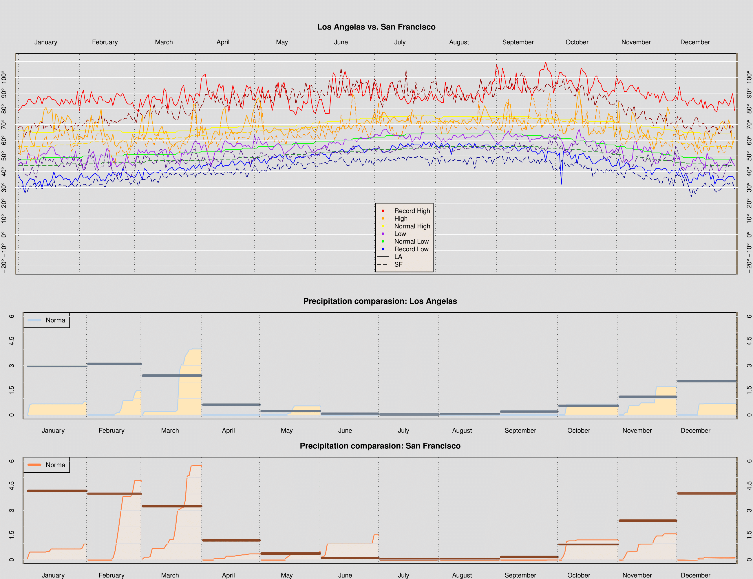
```r dgr_fmt <- function(x, ...) { parse(text = paste(x, "*degree", sep = "")) } #1 makePlotRegion_c = function(xlim, ylim, bgcolor, ylabels, margins, cityName, xtop = TRUE) { par(bg = bgcolor, mar = margins) plot(NULL, xlim = xlim, ylim = ylim, yaxt = 'n', xaxt = 'n') if(xtop){ axis(side = 2, at = ylabels, tick = FALSE, labels = dgr_fmt(ylabels)) axis(side = 4, at = ylabels, tick = FALSE, labels = dgr_fmt(ylabels)) }else{ axis(side = 2, at = ylabels, tick = FALSE, labels = ylabels) axis(side = 4, at = ylabels, tick = FALSE, labels = ylabels) } axis(side = 1 + 2 * xtop, at = c(15,45,75,105,135,165,195,225,255,285,315,345), tick = FALSE, labels = month.name) title(cityName) } #2 drawTempRegion_c = function(day, temp, col, ltype){ lines(x = day, y = temp, col = col, lty = ltype) } #3 addGrid_c = function(location, col, ltype, vertical = TRUE) { if(vertical){ abline(h = NULL, v = location, col = col, lty = ltype) }else{ abline(h = location, v = NULL, col = col, lty = ltype, lwd = 1.5) } } #4 monthPrecip_c = function(day, dailyprecip, normal, col1, col2, col3){ points(x = day, y = dailyprecip, col = col1, type = 'l', lwd = 3) polygon(x = c(day, max(day), day[1]), y = c(dailyprecip, 0, 0), col = col2, border = NA) points(x = day, y = rep(normal, length(day)), col = col3, type = "l", lwd = 4) } #5 finalPlot_c = function(ltemp, lpre, stemp, spre){ daysInMonth = c(31, 28, 31, 30, 31, 30, 31, 31, 30, 31, 30, 31) cumDays = cumsum(c(1, daysInMonth)) lnormPrecip = as.numeric(as.character(lpre$normal)) snormPrecip = as.numeric(as.character(spre$normal)) ### Add any additional variables that you will need here labels = paste(seq(-20,110,10), "^o ", sep="") remove_factor = function(x){ y = as.numeric(as.character(x)) return(y) } lpre$precip = remove_factor(lpre$precip) lpre$normal = remove_factor(lpre$normal) spre$precip = remove_factor(spre$precip) spre$normal = remove_factor(spre$normal) ### Set up the graphics device to plot to pdf and layout ### the two plots on one canvas pdf("rz_weather_compare", width = 13 , height = 10) layout(matrix(c(1,1,2,2,3,3), nrow = 3, ncol = 2, byrow = TRUE), height = c(2,1,1)) attach(laxMonthlyPrecip); attach(laxWeather); attach(sfoWeather) attach(sfoMonthlyPrecip) ### Call makePlotRegion to create the plotting region ### for the temperature plot makePlotRegion_c(xlim = c(13,353), ylim = c(-20,110), bgcolor = "gray87", ylabels = seq(-20,100,10), margins = c(2,2,7,2), cityName = "Los Angelas vs. San Francisco") ### Call drawTempRegion 3 times to add the rectangles for ### the record, normal, and observed temps day, temp, col, ltype drawTempRegion_c(day = 1:365, temp = ltemp$RecordHigh, col = 'red',ltype = 1) drawTempRegion_c(day = 1:365, temp = stemp$RecordHigh, col = 'darkred',ltype = 5) drawTempRegion_c(day = 1:365, temp = ltemp$RecordLow, col = 'blue',ltype = 1) drawTempRegion_c(day = 1:365, temp = stemp$RecordLow, col = 'darkblue',ltype = 5) drawTempRegion_c(day = 1:365, temp = ltemp$NormalHigh, col = 'yellow',ltype = 1) drawTempRegion_c(day = 1:365, temp = stemp$NormalHigh, col = 'gold1',ltype = 5) drawTempRegion_c(day = 1:365, temp = ltemp$NormalLow, col = 'green',ltype = 1) drawTempRegion_c(day = 1:365, temp = stemp$NormalLow, col = 'forestgreen',ltype = 5) drawTempRegion_c(day = 1:365, temp = ltemp$High, col = 'orange',ltype = 1) drawTempRegion_c(day = 1:365, temp = stemp$High, col = 'darkorange',ltype = 5) drawTempRegion_c(day = 1:365, temp = ltemp$Low, col = 'purple',ltype = 1) drawTempRegion_c(day = 1:365, temp = stemp$Low, col = 'purple4',ltype = 5) ### Call addGrid to add the grid lines to the plot abline(h = NULL, v = cumDays, col = "gray17", lty = 3) abline(v = -0.7, col = "wheat4", lwd=3, lty = 1) abline(v = 366.3, col = "wheat4", lwd=3, lty = 1) abline(h = seq(-20,110,10),v = NULL , col = "white", lty = 1) ### Add the legend legend(x = 182.5, y = 20, legend = c("Record High", "High", "Normal High", "Low", "Normal Low", "Record Low", "LA", "SF"), bg = "seashell2", col = c("red", "orange", "yellow", "purple", "green", "blue", "black", "black"), lty=c(NA, NA, NA, NA, NA, NA,1,5), pch=c(20, 20, 20, 20, 20, 20,NA,NA)) ### Call makePlotRegion to create the plotting region ### for the precipitation plot makePlotRegion_c(xlim = c(13, 353), ylim = c(0, 6), bgcolor = "gray87", ylabels = seq(0,6,1.5), margins = c(2,3,3,2), cityName = "Precipitation comparasion: Los Angelas", xtop = FALSE) ### Call monthPrecip 12 times to create each months ### cumulative precipitation plot. To do this use ### day, dailyprecip, normal, col1, col2, col3 sapply(1:12, function(m) { ### code monthPrecip_c(day = cumDays[m]+ltemp$Day[ltemp$Month==m], dailyprecip = cumsum(ltemp$Precip[ltemp$Month==m]), normal = lnormPrecip[m], col1 = "slategray2",col2="wheat1",col3="slategray4")}) ### the anonymous function calls monthPrecip with the ### appropriate arguments legend("topleft", legend=c("Normal"), col = "slategray2", lty = 1, lwd = 4) ### Call addGrid to add the grid lines to the plot abline(v = -0.7, col = "wheat4", lwd=3, lty = 1) abline(v = 366.3, col = "wheat4", lwd=3, lty = 1) abline(h = seq(0, 10, by = 1),v = NULL, col = "gray87", lty = "solid") abline(h = NULL, v = cumDays , col = "gray17", lty = 3) makePlotRegion_c(xlim = c(13, 353), ylim = c(0, 6), bgcolor = "gray87", ylabels = seq(0,6,1.5), margins = c(2,3,3,2), cityName = "Precipitation comparasion: San Francisco", xtop = FALSE) ### Call monthPrecip 12 times to create each months ### cumulative precipitation plot. To do this use ### day, dailyprecip, normal, col1, col2, col3 sapply(1:12, function(m) { ### code monthPrecip_c(day = cumDays[m]+stemp$Day[stemp$Month==m], dailyprecip = cumsum(stemp$Precip[stemp$Month==m]), normal = snormPrecip[m], col1 = "sienna1",col2="seashell2",col3="sienna4")}) ### the anonymous function calls monthPrecip with the ### appropriate arguments legend("topleft", legend=c("Normal"), col = "sienna1", lty = 1, lwd = 4) ### Call addGrid to add the grid lines to the plot abline(v = -0.7, col = "wheat4", lwd=3, lty = 1) abline(v = 366.3, col = "wheat4", lwd=3, lty = 1) abline(h = seq(0, 10, by = 1),v = NULL, col = "gray87", lty = "solid") abline(h = NULL, v = cumDays , col = "gray17", lty = 3) ### Add the legend ### Close the pdf device dev.off() dev.off() } finalPlot_c(ltemp = laxWeather, lpre = laxMonthlyPrecip, stemp = sfoWeather,spre = sfoMonthlyPrecip) ```
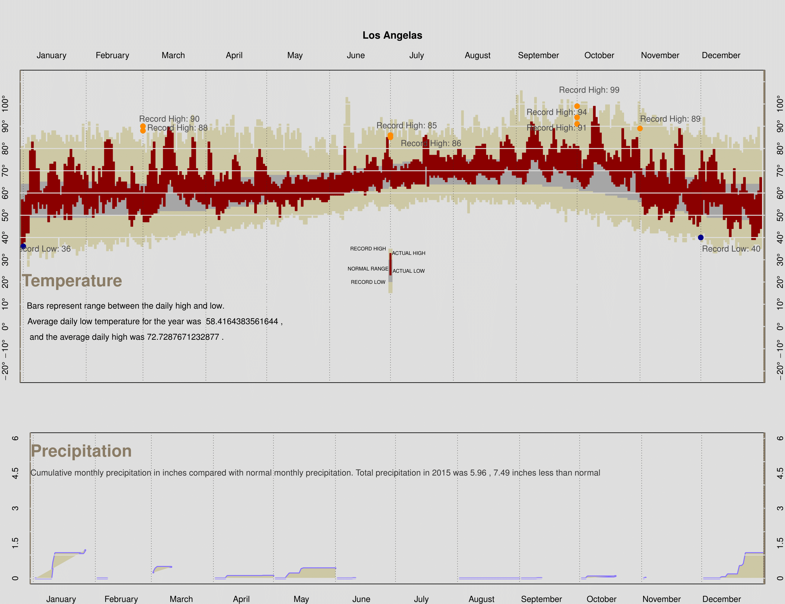
The dataset for 2015 weather is created by myself. The instruction for this project giving a URL link to data source of 2011 in LA. Thus i changed the year to be 2015 from 2011 to get weather data of Jan 2015. Keep doing so to gather all 12 months data source. I created a csv by myself which contain 365 rows and 12 variables(i concatened precip record with precip year.) The dataset enabled me to do the following process.
Code
```r #Creating a csv file by collecting data from URL: #http://www.wrh.noaa.gov/climate/monthdisp.php?stn=KLAX&p=temperature&mo #n=1&wfo=lox&year=2011 #for each month, then import the dataset. LA2015 <- read.csv("weather2015_LA.csv") precip = numeric(12) for(i in 1:12){ precip[i] = sum(LA2015$Precip[which(LA2015$Month == i)],na.rm = TRUE) } LA2015precip <- data.frame(precip = precip , normal = laxMonthlyPrecip$normal) finalPlot_2015 = function(temp, precip){ daysInMonth = c(31, 28, 31, 30, 31, 30, 31, 31, 30, 31, 30, 31) cumDays = cumsum(c(1, daysInMonth)) normPrecip = as.numeric(as.character(precip$normal)) ### Add any additional variables that you will need here labels = paste(seq(-20,110,10), "^o ", sep="") remove_factor = function(x){ y = as.numeric(as.character(x)) return(y) } precip$precip = remove_factor(precip$precip) precip$normal = remove_factor(precip$normal) ### Set up the graphics device to plot to pdf and layout ### the two plots on one canvas pdf("rz_LA2015", width = 13 , height = 10) layout(matrix(c(1,1,2,2), nrow = 2, ncol = 2, byrow = TRUE), height = c(2,1)) ### Call makePlotRegion to create the plotting region ### for the temperature plot makePlotRegion(xlim = c(13,353), ylim = c(-20,110), bgcolor = "gray87", ylabels = seq(-20,100,10), margins = c(2,2,7,2), cityName = "Los Angelas") ### Call drawTempRegion 3 times to add the rectangles for ### the record, normal, and observed temps drawTempRegion(day = 1:365, high = temp$Record.High, low = temp$Record.Low, col = "lemonchiffon3") drawTempRegion(day = 1:365, high = temp$NormalHigh, low = temp$NormalLow, col = "gray65") drawTempRegion(day = 1:365, high = temp$High, low = temp$Low, col = "darkred") ### Call addGrid to add the grid lines to the plot addGrid(location = cumDays , col = "gray17", ltype = 3, vertical = TRUE) abline(h = NULL, v = -0.7, col = "wheat4", lwd=3, lty = 1) abline(h = NULL, v = 366.3, col = "wheat4", lwd=3, lty = 1) addGrid(location = seq(-20,110,10) , col = "gray87", lty = 1, vertical = FALSE) points(cumDays[3], LA2015$Record.High[73], col = 'darkorange', pch=20, cex = 2) points(cumDays[3], LA2015$Record.High[74], col = 'darkorange', pch=20, cex = 2) points(cumDays[7], LA2015$Record.High[199], col = 'darkorange', pch=20, cex = 2) points(cumDays[7], LA2015$Record.High[200], col = 'darkorange', pch=20, cex = 2) points(cumDays[10], LA2015$Record.High[283], col = 'darkorange', pch=20, cex = 2) points(cumDays[10], LA2015$Record.High[284], col = 'darkorange', pch=20, cex = 2) points(cumDays[10], LA2015$Record.High[285], col = 'darkorange', pch=20, cex = 2) points(cumDays[11], LA2015$Record.High[325], col = 'darkorange', pch=20, cex = 2) points(cumDays[1], LA2015$Record.Low[1], col = 'darkblue', pch=20, cex = 2) points(cumDays[12], LA2015$Record.Low[350], col = 'darkblue', pch=20, cex = 2) ### Add the markers for the record breaking days text(x = 73, y = 93, labels = paste('Record High:',LA2015$Record.High[73]), cex = 1, col = 'grey30') text(x = 77, y = 89, labels = paste('Record High:',LA2015$Record.High[74]), cex = 1, col = 'grey30') text(x = 190, y = 90, labels = paste('Record High:',LA2015$Record.High[199]), cex = 1, col = 'grey30') text(x = 202, y = 82, labels = paste('Record High:',LA2015$Record.High[200]), cex = 1, col = 'grey30') text(x = 280, y = 106, labels = paste('Record High:',LA2015$Record.High[283]), cex = 1, col = 'grey30') text(x = 264, y = 96, labels = paste('Record High:',LA2015$Record.High[284]), cex = 1, col = 'grey30') text(x = 264, y = 89, labels = paste('Record High:',LA2015$Record.High[285]), cex = 1, col = 'grey30') text(x = 320, y = 93, labels = paste('Record High:',LA2015$Record.High[325]), cex = 1, col = 'grey30') text(x = 10, y = 35, labels = paste('Record Low:',LA2015$Record.Low[1]), cex = 1, col = 'grey30') text(x = 350, y = 35, labels = paste('Record Low:',LA2015$Record.Low[350]), cex = 1, col = 'grey30') ### Add the titles options(digits = 4) text(x=25, y = 20, labels = "Temperature", cex = 2, col = "wheat4", font=2) text(x=51.5, y = 9, labels = "Bars represent range between the daily high and low.", cex = 1, col = "black") text(x=66, y = 2, labels = paste("Average daily low temperature for the year was ",mean(LA2015$Low,na.rm = TRUE),","), cex = 1, col = "black") text(x=52, y = -5, labels = paste("and the average daily high was",mean(LA2015$High,na.rm = TRUE) ,"."), cex = 1, col = "black") rect(xleft=(364/2)-1, xright=(364/2)+1, ytop= 30+5 , ybottom=15, col="lemonchiffon3",border=NA) rect(xleft=(364/2)-1, xright=(364/2)+1 ,ytop= 25+5, ybottom=20, col="gray65",border=NA) rect(xleft=(364/2)-0.5, xright=(364/2)+0.5, ytop=28+5, ybottom=23, col="darkred",border=NA) text(x=(364/2)-11, y = 35, labels = "RECORD HIGH", cex = .6, col = "black") text(x=(364/2)-11, y = 20, labels = "RECORD LOW", cex = .6, col = "black") text(x=(364/2)-11, y = 26, labels = "NORMAL RANGE", cex = .6, col = "black") text(x=(364/2)+9, y = 33, labels = "ACTUAL HIGH", cex = .6, col = "black") text(x=(364/2)+9, y = 25, labels = "ACTUAL LOW", cex = .6, col = "black") ### Call makePlotRegion to create the plotting region ### for the precipitation plot makePlotRegion(xlim = c(13, 353), ylim = c(0, 6), bgcolor = "gray87", ylabels = seq(0,6,1.5), margins = c(2,3,3,2), cityName = "", xtop = FALSE) ### Call monthPrecip 12 times to create each months ### cumulative precipitation plot. To do this use sapply(1:12, function(m) { monthPrecip(day = cumDays[m]+temp$Day[temp$Month==m], dailyprecip = cumsum(temp$Precip[temp$Month==m]), normal = rep(NA, 12)[m]) }) ### the anonymous function calls monthPrecip with the ### appropriate arguments ### Call addGrid to add the grid lines to the plot total = sum(precip$precip) dif = total - sum(precip$normal) abline(v = -0.7, col = "wheat4", lwd=3, lty = 1) abline(v = 366.3, col = "wheat4", lwd=3, lty = 1) addGrid(location = seq(0, 10, by = 1), col = "gray87", ltype = "solid", vertical = FALSE) addGrid(location = cumDays , col = "gray17", ltype = 3, vertical = TRUE) ### Add the titles text(x = 25, y = 5, labels = "Precipitation", cex = 2, col = "wheat4", font=2, pos=3) text(x = 142, y = 4.5, labels = paste("Cumulative monthly precipitation in inches compared with normal monthly precipitation. Total precipitation in 2015 was 5.96",",","7.49 inches less than normal"), cex = 1, col = 'grey20') ### Close the pdf device dev.off() dev.off() } finalPlot_2015(temp = LA2015, precip = LA2015precip) ```